Karim Yeung
Azzurri’s mobile optimised and branded website
- in-house -
- October 17, 2015 -
- Azzurri Communications -
- http://www.azzurricommunications.co.uk
Brief
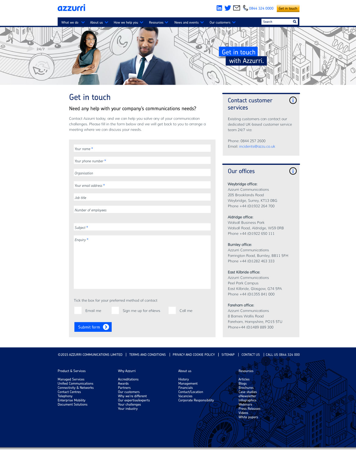
After the rebrand of Azzurri Communications, the company website was redesigned to reflect the new corporate style. As part of the project the website was designed to be fully mobile responsive and the site navigation was simplified, making content more easily accessible. Several web page templates were designed: the homepage, product landing page, standard content page, resource homepage, resource listing page and a contact page. The website design was implemented by Azzurri’s external web agency and content managed using Sitecore.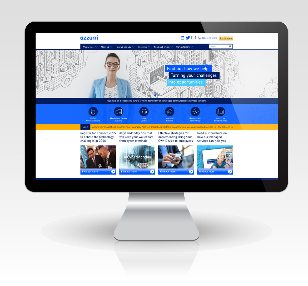
The Azzurri homepage incorporated a rotating banner feature with six product areas displayed directly below the banners. It was designed so that even on smaller screen resolutions (notebooks and laptops) the product areas were still visible above the scroll line. It then contained a scrolling newsfeed and four key areas that could be changed regularly to drive visitors to different areas of the website.
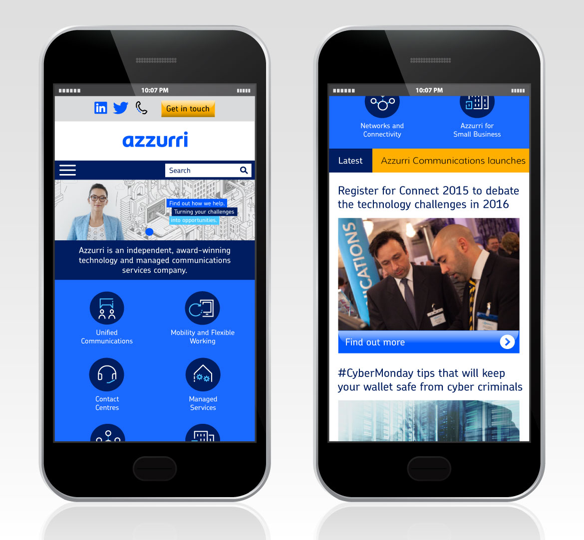
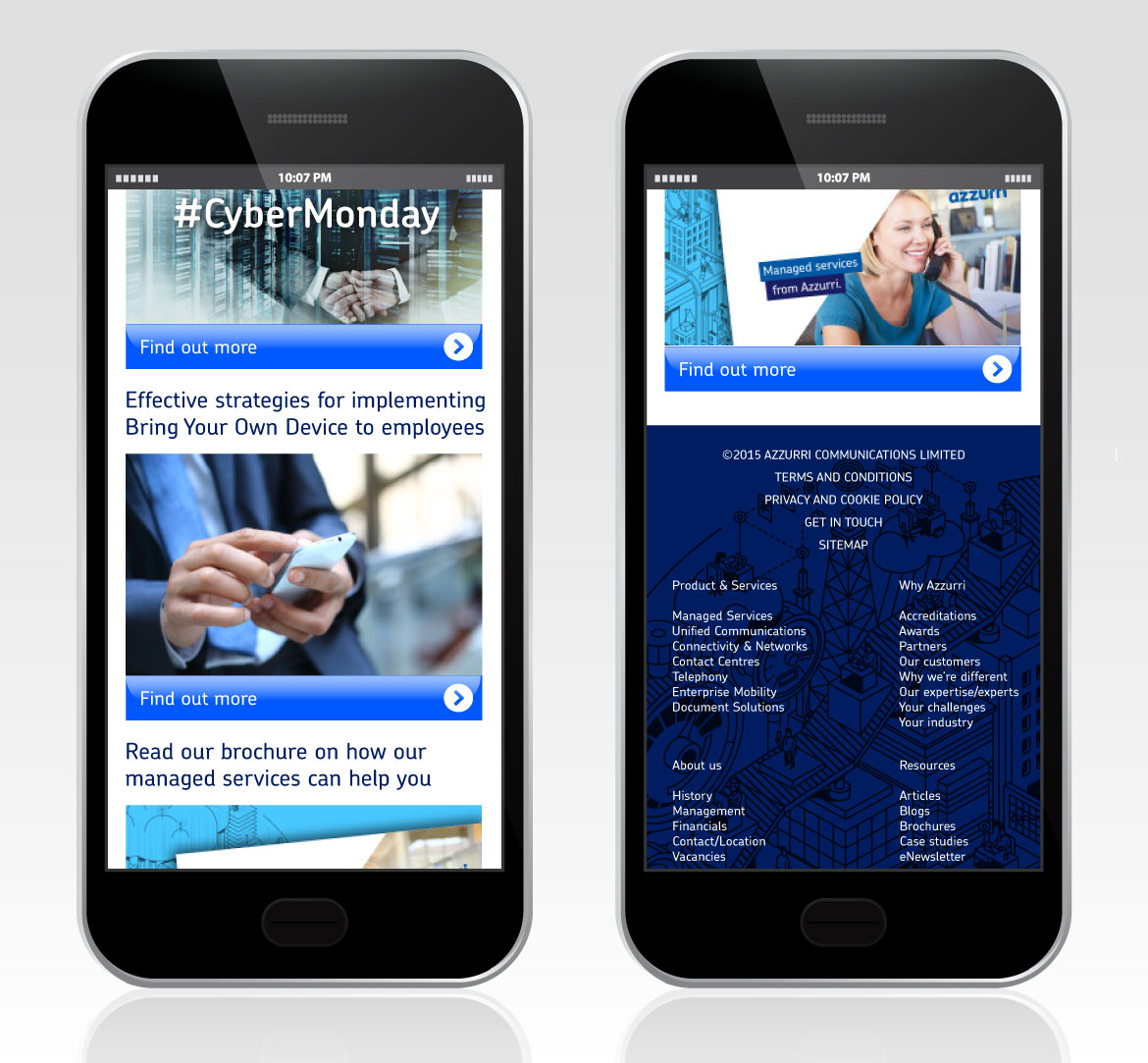
The website was fully mobile responsive and was designed using a grid system, making it easy for content to rearrange when a smaller screen resolution was detected.
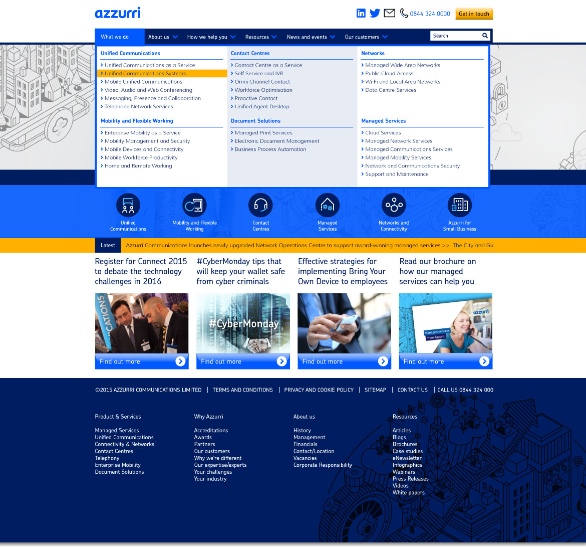
The website used a mega menu as the main point of navigation across the site. It was decided this was the best method for new web visitors to see the breadth of technology expertise of Azzurri, whilst making it easier for regular visitors to immediately locate the web page they wanted to access.
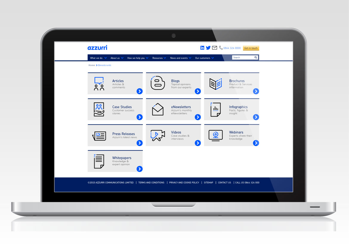
Azzurri’s resources page: A webpage providing access to all of Azzurr’s marketing content including blogs, e-newsletters, product brochures, customer case studies, customer videos, infographics, whitepapers, press releases and reports.
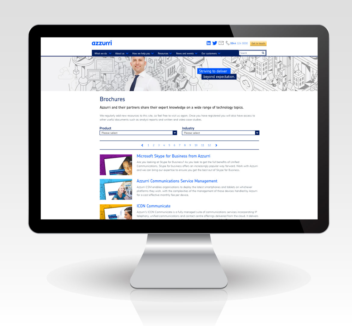
A resource listing page showing all the items the viewer can access and download. The page had a filter system to narrow down the search parameters, making it easier to search for relevant content.
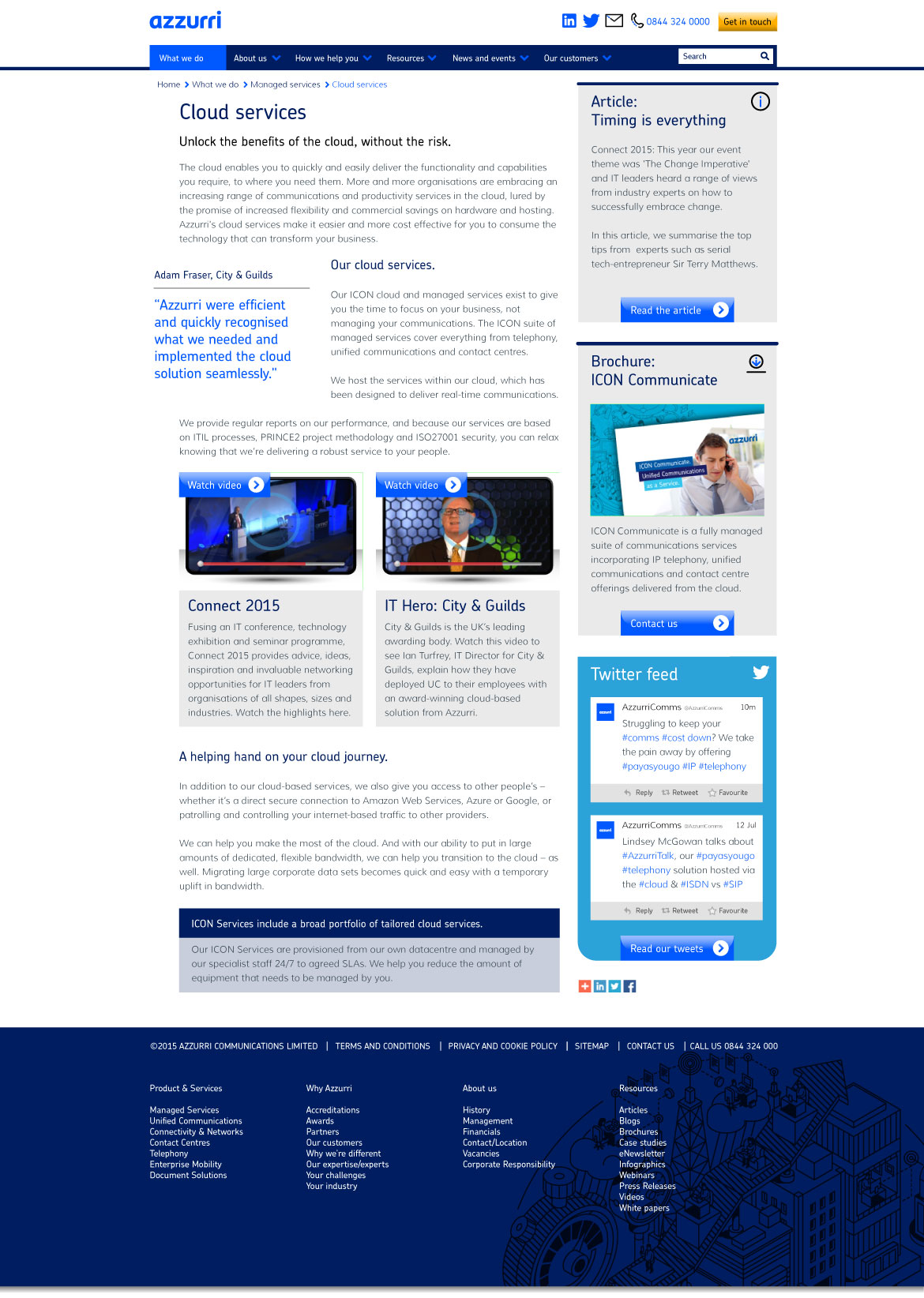
An example of a product content page. The page layout had many features that could be used to customise each page to make them more engaging and relevant to the viewer. Quotes could be inserted, video players, right hand information boxes to drive usage to other areas, twitter feeds and information hightlight boxes were design elements that could be used to help break up the body copy.
Back to portfolio About me Contact me